Harnessing psychology principles to empower UX

Relaxed? Read on.

In a world that’s becoming inherently ‘on-demand’, when attention spans are shorter than ever and products more complex. How do we design rewarding user experiences (UX) that will keep people coming back?

Is it possible to optimise experiences by utilising specific psychological principles?

It’s worth noting I reference academic work within this blog post. For anyone that’s interested, I’ll happily provide a further reading list.

As a top level overview into the topic I’ll focus on four main areas:

  • Cognitive load
  • Processing fluency
  • Hedonic adaptation
  • Dopamine loops

Cognitive load

The total amount of mental effort being used in your working memory to complete a task. For instance asking someone to make a cup of tea has a low cognitive load, which makes a conversion (the action happening) very likely. However if I asked someone to complete a complex algebraic equation, the conversion would be less likely based around the effort and skill needed to complete. Therefore, simply put, we need to;

  • Lower the mental effort required to complete the task.
  • This is especially important on mobile, as part of the cognitive load is used dealing with varying environmental issues.

In a test carried out by Ericsson ConsumerLab, they found that the stress levels of users waiting for a mobile digital experience to load was directly comparable to watching a horror film. Scary stuff.

Cognitive load associated with stressful situations

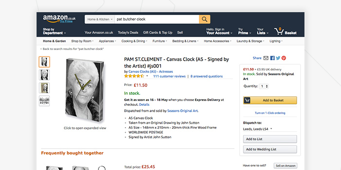
A great example of managing cognitive load is the Amazon PDP. The product reviews are clearly displayed, demonstrating social proof, the clear CTA’s and the option for 1-Click-Checkout; reduce the user effort further, which will result in higher conversions.
Or, in the case of one of our clients Moneycorp, whose PPC landing page was performing poorly. Through the use of simplifying content, streaming functionality and applying the affordance principle we increased mobile conversion by over 400%.
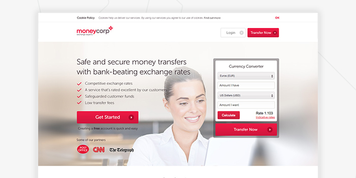
Moneycorp - PPC landing page

Key values to remember

  • Reduce actions to achieve goals.
  • Split complex processes.
  • Minimise visual clutter.

Processing fluency

The ease with which people process information.

Content that is easy to process (high in cognitive fluency) are usually perceived as more trustworthy, than content that is less so. There are a multitude of different tactics to increase cognitive fluency, some examples that we leverage are listed below.

Repetition

When we see or hear a statement repeatedly, the more we tend to rate it as more likely to be true, regardless of whether we remember having seen it before. This is why we see repetitive CTA’s, phrases and marketing jingles. From the likes of “Kids and grown ups love it so, the happy world of…” are so rememberable and powerful.

Structure

The use of a message thats structure your customers will implicitly learn, so that when they see something similar, it feels familiar and therefore easier to process.

Find your greatness - Nike

Font, 3 words, full stop, it couldn’t be anything other than Nike; Just do it.

Perceptual fluency

To make something visually clear, stripping the design back to the core elements, thus making something more enjoyable to use, increasing conversion intent in the process.
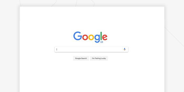
Google search

Linguistic fluency

To make something phonologically simple.

Use simple, straightforward words, coupled with sans-serif fonts to build brand affiliation.

Helvetica logos

All these logos use Helvetica variants to boost processing fluency and familiarity. Interestingly the inverse is true for serif and script based fonts, which tend to make people think more carefully or achieve a deeper retention of knowledge, case in point; Medium.

Key values to remember

  • Contrast between fonts and background.
  • Easy to read fonts.
  • Simple language.
  • Have direct CTA’s.

Hedonic adaptation

People become accustomed to positive or negative stimulus and those emotional effects change over time.

Over time we become de-sensitised to the same thing; be that features, concepts, rewards or results. Hedonic adaptation applies to everything from; apps, games, products, relationships or even roller coasters.

To combat this, products constantly need to evolve to surprise and delight. A great example of this would be Clash of Clans, an online game that arguably ignited the ‘freemium’ game model. The excitement after launched tailed off, making new ‘offerings’ vital to keep engagement. In turn they have added new features, content and even spin off versions of the core product to help keep engagement.
Clash of Clans

Key values to remember

  • Change layout / structure.
  • New content.
  • Update the UX*
  • Make rewards unpredictable.

* Be sure however not to frustrate your users. Change small, frequently and test.

Dopamine loops

Why have Twitter (the infinite feed), Tinder (matchmaking), Facebook (notification centre) become habitual products? They trigger dopamine. Which according to Arvid Carlsson and Nils-Ake Hillarp is critical in everyday life.

The problem or beauty of this, depending on your stance, is that the following Opioid ‘hit’ is never satisfying enough. After a typical working week, many may want to relax and have a drink afterwards to help relax(dopamine/wanting). When they head to their favourite pub and have their drink of choice (opioid/liking) the moment is satisfying enough to keep them engaged for long periods of time. However the opioid hit of, for example. a like on a Instagram, never offers true gratification, making the user carry on searching for more. Here in lies the problem or the beauty.

Key values to remember

  • We seek more than we’re satisfied
  • The anticipation is greater than the reward. 
  • Queued by external triggers.
  • Small, unpredictable rewards receive the greatest of all interaction rates.

Hopefully this introduction into basic psychology principles helps to explain how we empower our user experience (UX) solutions to deliver a delightful experience.

An Experiment in CUI

Could CUI (Conversational User Interface) be the future of a great online user experience? Let’s explore an idea where we talk our way around, rather than clicking and tapping through menus and lists.

The digital industry is in a really exciting position at the moment. Never before has there been so many creative avenues to explore and immerse yourself in. UX design has splayed out into an entire plethora of unique and specialist roles, that cover everything from behavioural study through analytics and user testing, to corporate strategy, rapid prototyping and design iteration.

UI design channels creativity in two particular directions. On one end of the scale, atomic design patterns and principles create a uniform experience across connected sites and services, where as at the polar opposite, we have UI designs that are completely experimental, flamboyant and uncharted.

So in this time of booming specialism and creativity, why is our overarching experience online still the same?

CUI Design Experiment - Hmmm?

It’s a thought I’ve been mulling over for several months. Let me explain my line of thought to put my statement into context. Generally speaking, I browse the web for all sorts of different reasons. I might be scouring Amazon for camping gear and car parts, keeping on top of all the latest tech on The Verge, or looking through Land-book or Muz.li for design inspiration. In any scenario, my mind is in one of two states: I either know what I’m looking for, or I don’t.

A majority of the time, I find myself skimming through an abundance of irrelevant content to get to the material that I am actually interested in. It’s a feeling similar to shuffling through my mail at home. There’s always a huge pile of junk and only a couple of envelopes that bare any relevance to my interests. What if we could cut through the noise, obliterate cumbersome navigation structures and actually get to the content that we want, when we want to see it?

It all starts with a conversation.

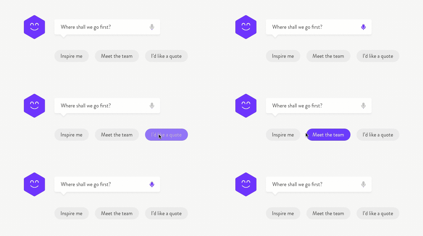
In this scenario I’ve reimagined the MadeByPi website and created a concept that is centred around starting a conversation to deliver content to the user. Let’s imagine that an initial prompt; “where shall we go first?” replaces the typical website navigation structure. We can abolish individual pages and deep navigation structures. There are no text links across the header, no burger icon or menu overlay and only a minimal amount of content on the page. Our logo, our PiBot, a text field with optional audible input and a few prompts which can either spur the conversation in a particular direction, or act as direct links to content.

CUI Design Experiment - Where shall we go first?

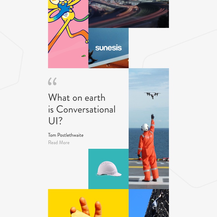
We do have a little more real estate to play with, so let’s introduce a simple feed that showcases a mixture of content from different areas of the site. Being able to show a sample of our work, studio culture and thoughts and opinions should compliment the CUI perfectly. It might just prompt the user to ask a question about a piece of content that they’ve seen, or encourage them to think a little deeper and ask about something that is more specific to their needs or interests.

CUI Design Experiment - Content feed

A personified User Experience.

Let’s imagine that I’ve visited the MadeByPi site previously. On my second visit, PiBot remembers me and welcomes me back. In this scenario however, the CUI serves more relevant content in my feed, based on my previous visit and wider browsing history. After all, you wouldn’t expect to be given the same greeting if you visited a high street store on a second occasion. Let’s say that I spent several minutes reading through our Sky Futures case study the last time I visited the site. The CUI might suggest similar case studies, or present me with relevant blog posts. If I had only scrolled half way through the case study on my previous visit, the CUI might remember and ask if I’d like to continue where I left off, or offer me the opportunity to read something similar. If I sit inactive for a little while, the CUI might ask me how it can be of further assistance, or help to channel me in a more relevant direction.

An interesting start.

The idea is of course purely conceptual but it is an interesting prospect none the less. With some applied conversational logic and a deep understanding of human behaviour, there is the potential to re-imagine our browsing experience for the better. As CUI technology advances, multiple CUI engines will have the ability to communicate and share data with one another. A conversation that you might have had on one site could provide a very detailed insight into your behaviour and browsing habits as a user. That data could be interpreted by our CUI to build a predetermined persona and engage in a conversation that delivers a truly personal experience. I’ll be exploring CUI in further detail in a post a little further down the line. I’d quite like to re-design a popular product or service and apply some real user testing to understand the practicality of CUI in real-life scenarios.

PiLabs

What is a Conversational User Interface (CUI)?

Conversational User Interface, (or CUI in short) is, in layman’s terms, another way for you to interact, engage and immerse yourself in an array of digital products and services.

Let’s think of it as an extension of our current interactions arsenal. We’re all familiar with clicking, tapping and swiping our way around a screen as a means to an end, and CUI should allow us to achieve the same results, with less effort, simply by entering into a conversation… Or at least that’s the big idea. It might just be the monumental shakeup that a stagnating digital industry needs but is it for better or for worse, and should we embrace it?

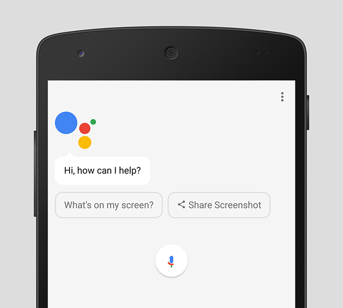
In its current state, CUI presents itself in two forms, one of which relies solely on generating a spoken conversation between you and the interface, with no means or necessity to see anything visual. The second state consists of a combination of spoken word and graphical user interface based input, either in the form of a text chat based system (just like Facebook Messenger, or WhatsApp), or through suggested and predetermined cues that can be clicked or tapped in order to spur the interaction into its next stage. In either scenario, you’ve more than likely engaged with some form of CUI this week, whether you’ve realised it or not.

Google Assistant Conversational User Interface (CUI) Initial Screen

Let’s start on a positive.

I’ve become used to shouting ‘OK Google’ across my living room to initiate an official adjudicator in an argument that I might be having with my girlfriend. “Who played Andy Dufresne in The Shawshank redemption?”, “Are there plans to build a bridge from Russia to Alaska?”, “Why do planes that are flying to New York fly up towards Iceland?”. That’s it. There’s no further intervention required and just five seconds after initiating a conversation the problem is solved. There’s one happy party and more often than not, it’s her, not me.

Conversational UI in this sort of scenario serves its purpose brilliantly. I haven’t had to pick up my phone, swipe through my PIN, open my browser and search for an answer to my question. Even then I might have had to sift through several websites with paragraphs of text trying to find a definitive answer that is factual and to the point. In reality, I just wouldn’t have bothered and my question would have gone unanswered. The beauty is, I’ve purely and simply engaged in a conversation and received an audible, spoken response. Whether or not it is based on fact depends on how much trust you are willing to put into the technology but I’m going with it.

Reflecting on the experience as a user; it’s a win win. I’ve completely eradicated the cumbersome and somewhat unnecessary steps involved in finding the answer to my question manually. Less steps, quicker results, better experience. I haven’t had to lift a finger.

I hit a stumbling block.

The next question in my series; “where can I fly to from LBIA?”, yielded a somewhat different response and this is where I begin to question the practicality of CUI in certain contexts. Rather than spieling off a list of destinations from the other side of the room, I heard “these are the top results” and then silence. This is where the CUI ends and the GUI begins but is it a problem or a blessing?

Google Assistant Conversational User Interface (CUI) Search Result Cards

I picked up my phone and took a look at the screen. Google Assistant has presented me with an array of cards packed with information. I can swipe left to reveal more cards, or tap a button to be taken to a search results page. In either case the GUI has communicated a wealth of information to me at a glance. My initial reaction was that it would have been better for the CUI to read it out to me. But in reality, would I have listened to it and would it have made any sense? Probably not and it would most definitely have consumed much more time listening to an automated voice rambling through three or four different cards than it did for me to glimpse at my screen.

This is the point that design comes into the equation. What is the best possible scenario for the user, how do you determine what that is and how do you quantify it? It’s a difficult situation and inevitably it is going to be different from one user to the other. In my own mind, I would have liked Google Assistant to have read out a list of destinations. Whether or not they were airline specific or seasonal wouldn’t have really been an issue there and then. All I asked was “where can I fly?”. After answering the initial question I would have expected to be prompted with a question from Google Assistant. Something along the lines of “Would you like to book a flight?”, or “Would you like to know prices?” for example. From that point, I could have engaged in a deeper conversation to find exactly what I wanted and ultimately book the flight, or at least share some suggestions with my girlfriend.

In the case of Google Home, or Amazon Alexa where there is absolutely no GUI available, how would it have dealt with my request? I can only assume that I would have engaged in a fifteen minute long conversation in order to digest a tumult of information that might only have taken seconds on screen.

Arguably the cards presented to me on screen were not really relevant to my search either but they did present me with the opportunity to digest a considerable amount of information quickly and act upon it promptly. I think that this validates the case for a harmonious relationship between the two interfaces. If a majority of the heavy work can be done through meaningful conversation that gets to the results that I want, it makes sense to have a conversation. If I feel at any point during that conversation that I would like to take a look at something visual, I should be able to. After all a picture speaks a thousand words but I’d also like the opportunity to continue my conversation if I wish to do so.

So what’s next?

Although CUI is proving its worth for every day mundane tasks, it’s not without its issues and I definitely wouldn’t have the confidence to engage in a conversation for anything more than asking basic questions, or checking the weather. I can only imagine the it’ll get better as the big players enhance their machine learning techniques to create truly contextual and more realistic conversations. The two biggest obstacles in my mind are the limitations of spoken conversation and the issue of trust. How many times do you find yourself having to show somebody a diagram, or a picture, or a map to help explain something better?

Of course, spoken language is only really half of the conversation. Body language, facial expressions, stances and gestures are equally important in understanding exactly what it is that someone is trying to say. Can technology adapt to such an extent that CUI designers can utilise sensors to read and interpret such signals and develop a better and more realistic experience?

On the subject of trust, how do I know that I am really getting best best price for my flight? If I decide to have a straightforward conversation with Google Assistant and accept to book a flight that it suggests, how do I know whether or not that particular airline is paying Google to promote their services? Has Google Assistant effectively offered me a spoken advert? Do I have to ask Google to compare prices for the best deal? Arguably, the same problem still exists through a GUI; it is just a personal preconception that the information presented to me on screen is somehow more open and accurate than information which may be hidden behind layers of conversation and I shouldn’t really have to dig for it, nor do I want to.

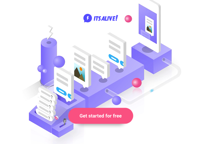
It's Alive Conversational User Interface (CUI) Bot Builder

Getting started.

So where do you begin in the world of Conversational UI design? Granted a new technology and an entirely new field for design is quite daunting. It’s also worth bearing in mind that just because it’s got ‘design’ in the title, it doesn’t necessarily mean that you need to pursue it. The first thing I realised once I started experimenting was that it’s probably more an opportunity for someone who has a deep understanding of language and human behaviour. None the less, gaining an understanding of the basics and making a start is surprisingly easy.

I have been experimenting with a ChatBot building service called ‘It’s Alive’. You can have a go for yourself at itsalive.io. It offers an intuitive and relatively straightforward insight into the logistics behind creating a conversational interface built on Facebook Messenger. You can publish the bot to your own site, test it, converse with it and share it with whoever you want, so give it a try and see what you can come up with.

In my next post, I’ll be talking about a CUI experiment that I’m working on for a future site concept. Can we scrap the conventional site navigation as we know it? We’ll see…

An Opinion On Homogeneous Design

The topic of “Homogeneity of Design” seems to be creeping back into the feeds of my various blue shaded social medias. I’d like to make a few points about digital design as I see it, from my perspective. Firstly, I’d obviously consider myself a creative / visual person. I love creating unique and distinct things; from my tattoos, brands, illustrations and digital ‘products’. I’ve always enjoyed looking and understanding the reasons why something is the way it is.

That said…

I think we would all agree, especially in digital design; industry established paradigms are good. Users learn to expect certain behaviours, because they are almost universal. Pull to refresh, navigation patterns, swipe to dismiss or even something as simple as a text link. These ‘elements’ are styles or interaction choices that a designer can utilise knowing that a user will instantly feel familiar with them. This is good, especially given the complexity of modern interfaces, ensuring users never feel out of their depth, even when completing complex tasks. This does mean however, that one social media app will look resemble another, but that’s fine. All socks are the same, it’s just the material that changes.

I can’t remember anyone complaining about the homogeneity of socks, a road sign or even a calculator. Thats because they’re functional for the ‘user’ and simply put – work. On the other hand, having just moved office. Seemingly every Phone/TV manufacturer feels the need to have a unique remote or interface that requires pot luck or a user guide to use.

homogeneous_tv_remote

Arguably digital design isn’t a visual expression. It is a framework, a medium between a user and a machine. The interface and interactions we create forms a global ‘digital’ language that everyone can use to communicate.

When designing a website, every designer would want it to look visually impressive and that’s really important. However it’s not the only challenge, ultimately the primary goal is to create something that users understand and enjoy using. Crafting a unique visual style to make the website look visually different from the competition is important for the brand. However this can’t be at the cost of usability and function. Ultimately a poor experience is often more costly to the brand than homogeneity.

I’m personally neither for or against Dribbble as a design platform. That said, blaming it for homogeneity within the design industry is misunderstanding the point. An example would be the ‘social media blue’ that seems to creep into every apps colour palette. The homogeneity of a product’s colour isn’t because of Dribbble, but because of colour theory and suitability. As designers we need to consider accessibility (text links, buttons, error states etc), user behaviour and recognition. This process ultimately leads to certain colours being more suitable for certain ‘products’.

homogeneous_icons

At the same time I’d hate to live in world where every website looks like it’s fallen out of Bootstrap, hitting every trend branch on the way down. Character is very important within a product, but a brands character isn’t just its visual design. As someone who spends a lot of time developing brands online, a lot of the character isn’t in the ‘visual’. It’s in the playful interactions, it’s in the cheerful copy, it’s in the nuance. Certain pages shouldn’t be too bold with their visual design, for instance a basket page of an Ecommerce website, but it can still communicate the brand via copy or animation.

Knowing when to break free from highly prototypical patterns is part of the art of digital design. It should only be done sparingly and at the right time. When done too frequently, users lose trust in the product because it removes itself from the norm; causing confusion and begging the question why. When never done, users lose interest because it seems formulaic and lacks any originality to make the experience feel exciting or fresh.

It’s easy to blame lack of innovation on designers and that we’re not looking for “better solutions”. That however sounds a touch naive. If as a designer I know certain patterns ‘work’ and users are happy to interact with them, why would I risk this? When checking train times do I want a “new experience”? No. Not really. mobile gambling I just want to be able to easily find out how to get somewhere and at what cost.

homogeneous_train

Usually, or should I say in my experience. The real wow factor of a ’product’ is the user completing their desired action effortlessly and in the shortest time possible. The sprinklings on top is the finesse of the experience (e.g. animations or great copy).

Of course, everyone needs to experiment. Without it we wouldn’t improve or develop anything we have. If you do experiment, do it slowly and responsibly with the user in mind. Ensure it has a purpose that serves your users and not to simply be ‘different’.

So to conclude. Don’t strive to be different. Strive to improve.

The future of UI isn’t flat, 2.0, material or burger based

I remember arriving at my interview with MadeByPi and discussing the future of UI and the case study of how people use Google to search.

Let’s hypothetically say I needed to access information about the flu and whether I’d be entitled to a free vaccination on the NHS.

Would I navigate onto the NHS website, use their menu or internal search to find the page I need. Probably not. I’d simply ‘Google’:

“NHS flu vaccinations requirements”

Then I’d judge the results to quickly find the appropriate page, click, and then consume the information I want. Well, what if I could send a message and find out if I am entitled to the vaccination and receive a reply with the answer and whether I wanted to book the next available appointment near me. All through a couple of messages, without ever having to use a ‘website’.

Enter Magic, Operator and the soon to be Facebook M. These ‘invisible’ or ‘conversational’ apps revolve around a single messaging screen.

Matti Makkonen was a software engineer and an unsung hero of modern life: He invented the SMS. This ‘technology’ is the most used application in the world. Three years ago it had an estimated 4 billion active users, which at the time was 4 times the amount of Facebook. Messaging in whichever form is a fundamental form of human communication that is reflected in the sky-high valuations of apps such as WhatsApp and WeChat.

Currently sat at work, if I want to communicate with the member of the team I’d message them on Skype, if I wanted to plan a night out with friends I’d send a group message on WhatsApp or if I wanted to moan at poor service from a company I’d probably take to Facebook or Twitter to vent. So while messaging has become a cornerstone of personal communications it hasn’t ever been fully implemented beyond that. What if messaging could transform the way be interact with computers, in the same way way we interact with each other?

“I’ve seen things you people wouldn’t believe”

Have you ever used a live chat on a website and wondered whether you are speaking to a machine or a person? Have you ever tried to throw some curve balls into the conversation to try and tell them apart?

This is us carrying out the Turing Test. A test invented by Alan Turing, the man who successfully cracked the unbreakable; the Enigma machine. He created the test to prove if there was such a thing as AI and how to identify it. The test revolves around a subject (a human) having a conversation with another ‘party’ (a machine). If at the end of that conversation the subject believed they were having a conversation with a person, the machine passes and true AI is born. This subject is tackled by a multitude of different Si-Fi movies from Blade Runner to more recently Ex-Machina.

While a replicant or a robot such as Ava is a long way away, we have got robots that are good at simulating humans in narrow contexts. One of those contexts in particular is messaging. This is thanks to a process called deep learning, where a computer is taught to understand and solve a problem by itself, rather than needing engineers to code a response. Therefore messaging is the golden ticket into the realm of AI as it doesn’t carry the additional baggage of other forms of communication such as accents or physical gestures.

Furthermore messaging makes for a great user experience rather than a traditional app as it feels natural and familiar. When messaging becomes the UI, the user doesn’t need menus, buttons, labels, filters and pagination. This explains the current rise in popularity of Invisible and Conversational apps, but the reason why we should take note goes beyond that.

You could argue that Conversational apps have a UI; they work via a screen and need a chat interface that currently might point the user to a conventional ‘website’. But we are at the tip of an iceberg, take a look at these videos:


Key note for both. Neither require a UI for computer input.

As a designer this is a shocking trend to realise. In a future where a computer can see, listen, talk, understand and reply to you, what is the purpose of a UI? Why bother making an app to book a holiday, when I can just communicate it with it directly? Welcome to the world of Brain-Computer Interaction. A world of Digital-Telepathy coupled with AI, removing the need for a screen.

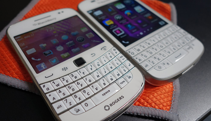
Are we approaching a new technological tiller? A concept originally introduced by Scott Jenson in 2014. A technological tiller is when we hamper new technology by applying an old design. For example I’d argue the original Blackberry’s having a standard physical buttons rather than being part of a touch screen was a technological tiller from the days of the trustworthy Nokia 3210.

Blackberry phone

What if a screen becomes the next technology tiller? And what if good design becomes avoiding a screen all together?

The new start ups developing Invisible and Conversational apps champion this principle. They push the concept of the product been the service and the UI/screen, simply the medium. If the screen becomes unnecessary or a better medium arrives (VR for example), that offers a better experience, then it should definitely evolve.

So what now for UI designers?

Is UI obsolete and AI the future? No, I don’t think thats the case. What I do believe though is just how responsive designs changed the face of web. New technology will force change once again and designers we will have to adapt and evolve with the technologies on offer. Currently a ‘screen’ in one form or another (VR, Wearable tech; Google Glass and even Apple TV) will still be around for a while. All ‘mediums’ pose different design problems to solve. However in the future you could argue design will become infinitely more invested in UX as we find innovative ways to interact with our replicant friends and UI’s become rarer in their traditional form.

Using UX principles to underpin a product

During my digital career I’ve done the Hokey Cokey between being predominantly a UI or UX designer. I often get asked what’s the difference between the two. In my experience, there’s a lot of cross-overs between the two, with the noticeable difference being that of focus. Working in the teams I have; a UI designer is primarily focused on creating a interface thats aseptically pleasing. Fairly straightforward. Whereas a UX designer has to create from the mind-space of a user. Predicting patterns, goals, needs and flagging potential issues in the usability of the product.

When tackling virtually any project I usually ask myself a series of questions to help guide the design process.
Understanding and maintaining these principles for the full life cycle of the project WILL result in a more successful final product.

Is it easy to digest?

The user journey should be broken down to give the user performable tasks, without unnecessary fragmentation. We are wanting to simplify the task without it feeling diluted and clumsy.

This should be go far beyond easy-to-read copy. The process starts with IA, site maps and user journeys. Ensuring content can be found where a user would expect and it’s well presented utilising functionality and layout options.

Don’t forget user’s need guidance. Sometimes they need a helping hand to reach their end goal and remember to offer multiple routes to get to that point. For example offering them a sub navigation with 10+ similar pages could becoming daunting and confusing trying to find the specific content they require.

Consider every decision a user has to make to get to the bottom of the funnel.

Does it communicate a clear message?

Aside from communicating your value proposition, you need the user to understand the actual value of using your product. Be clear and upfront about your product, offer the user all the information they need to make an educated decision.

Linked to value, pricing is an area where being clear is vital. Users simply won’t ‘buy’ if they can’t figure out the true cost. If you need to hide the cost, there’s probably a reason.

As simple as it sounds, imagine you were browsing the product for the first time. What would you want to know? How would you want to be told?

Trust & reward?

A cohesive design is a great way to build trust. Before requiring the user to complete any action, inform them why the task is needed (the reward). These clear explanations help build trust at each step, leading to easier conversions further along the funnel.

Take Uber for instance. Getting a taxi is now easier than ever, resulting in the ‘traditional’ industry becoming increasing unsettled. The App requires payment information for instance. This further down the line allows for quick and safe payments to be made. A task (entering payment information) that has a clear goal and end result for the user. Always offer the user a reason a complete a task and sign-post their progress through it.

Building trust and rewarding the user with additional functionality should create an invisible experience. As decisions (user journeys) require less time and mental/physical resource. Thus using the product becomes easier and more enjoyable to use.

Original, but familiar?

Awe-inspiring design is great, but design that doesn’t convert could be considered art. Impressive CSS animations and rich multi-media experiences might look great but if no-one can navigate to their goal it’s pointless. Aim to utilise web standards where possible to ensure a smooth user journey. Does a button draw the users eye and look clickable?

As simple as possible?

It’s incredibly rare to offer a product that has no competition. Therefore execution of said product is arguably just as important. As a general rule, the simpler you can make a complex problem or task, the more enjoyable it is for the user. The ultimate goal should be to become a benchmark, when a user forgets it’s a ‘product’ and simply see’s it as a useful tool to achieve said goal.

Be the user

Consider every aspect; their age, physical and mental ability, interests, state of mind, environment and goals. Be thoughtful and show you care. It’s important as 68% of users give up if they think your product hasn’t being tailored to them.

Designing for People

A product is only as good as its ability to adopt behaviour

blog - designing for people - 1

The internet is overloaded with the remains of once beautiful products that were executed to perfection, but failed to gain any traction from users. They failed to fit into, or change, the behaviour patterns of their users.

This raises the question: Why?

When a behaviour or an action doesn’t occur, it tends to be because one of more of the three following things is missing or lacking.

– Motivation, the desire.
– Ability, the skills.
– Trigger, the prompt.

For a behaviour to occur, a person must be first motivated and able to perform the behaviour. If they have the motivation and the ability to perform the given behaviour, they will when this behaviour is triggered or prompted.

This is the basis for the Fogg Behavior Model.

The three elements can be broken down further into a lot more depth, however let’s keep at this top level and use the example behaviour of physical exercise, that hour a day we all struggle with.

I did plan on going to the gym yesterday, sadly I didn’t.

But Why?

I could have forgotten to go. I might have been desperately trying to finish of the final season of Breaking Bad before I get told any more spoilers. In this example the behaviour wasn’t completed due to a lack of a trigger or a prompt.

Or, I might now have gone to the gym as I went out with friends the night before and was feeling completely shattered when I got home. In this case the behaviour wasn’t performed due to a lack of ability, the skills.

Or, If I’m being honest I might not have gone, simply because I haven’t got the desire to go, the behaviour in this case wasn’t completed due to a lack of motivation.

So, if you’re looking at a behaviour, such as updating your status on Facebook, we need to identify where the problem lies. In most behaviours all three elements are somewhat to blame. However usually theres a single element that stands out, a behaviour bottleneck that must be resolved.

Just a little push, the trigger

blog - designing for people - 2

After working on a series of apps revolving around user behaviours, the bottleneck tends to lie with the trigger.

The can be broken down into 2 main categories; Internal and External.

An internal trigger is created when a user has a great experience with the app. An association is made between the app and the need of opening said app. For example the trigger for opening Twitter could be “that’s interesting. I need tell people about this”. For Instagram it could be “that that looks cool, I’m going to take a photo”. Or a personal favourite Vouchercloud “Is there anywhere nearby I can dine at a discount”. Internal triggers tap into our needs, desires and curiosity and therefore are impossible to measure or rely upon. Hence the reason why external triggers are a designers best friend.

External triggers take many forms. From; Emails, notifications, adverts, complimentary products and ‘text messaging’ to name a few.

As in web design, if a user is presented with a call to action when they are able and motivated (even remotely) to perform a behaviour, it’s likely a majority will. If once ‘in’ the app, they have a good experience, they will be reinforced to use it again in the future. Need = Solution. If the app fills this requirement enough times a habit is formed.

Companies such as Twitter have relied on external triggers to build habits into their users. The end goal is to get your users to think about your app as much as possible.

This ultimately increases the probability of the users opening the app and building the association between the app and the ‘use’ it has on a day to day basis.

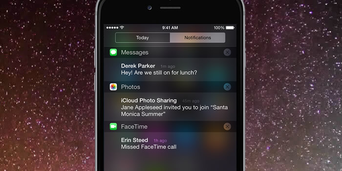
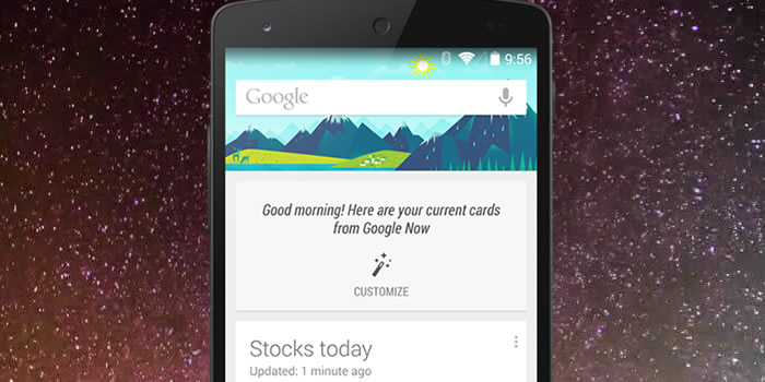
For example something that Google are working on with Google Now. Notifications that aim to aid and guide me on a day to day basis. Notifications saying: Need something? just type or talk here. Want to get home? Use this bus route. You’re near a popular restaurant, take a look at the menu. Your going to need your jacket tomorrow, check out the weather.

This strategy surely helps build a habit between an ‘app’ and a user as it doesn’t require the user to be taught a new behaviour. It evolves around their current ones.

This tactic also helps curve the current smartphone behavioural dynamics, where people are often overwhelmed by the number of apps they have. Your app will likely be one of 50 or even a 100 and it’s also incredibly likely that you’re one a group of new apps installed that week. Therefore if your not front and centre, in the users field of view (as a widget for example) it’s likely you’re going to become forgotten.

This is why external triggers are vital to the development of an app. They remind the user that the app can serve a purpose to them and when they might need it. Triggers can seem annoying in principle, but that’s not necessarily true for the user. As a user we want them to be constantly thinking about the app, therefore they shouldn’t be surprised or excited to see one. This is why it is difficult to identify harmful/annoying notifications to the user. The best approach is to simply carry out research in the real world to evaluate their reach,success and effectiveness.

As with any form of notification there is always a threshold above which uninstall / unsubscribe rates sky rocket. However up until that point, the more triggers the better when trying to establish a behaviour.

 They have the Skills, the ability

blog - designing for people - 4

If the initial trigger isn’t the bottleneck, the second offender to tackle is ability. If an app is difficult to use, people won’t bother and will simply move on to a simpler alternative.

Ability is all about usability and fine tuning this to ensure a silky smooth experience, underpinned via user testing.

Ability is broken down by Fogg into 6 sub-categories; time, money, cognitively demand, physically demand, social deviance and non-routine. These form ‘road-blocks’ that can get between the behaviour and the user. For example does a behaviour demand a lot of time or money? This will result in the user having a low ability to perform it and so on.

Out of the 6 sub categories i’d argue the most important is the time it takes to complete said task. If a task is quick to complete chances are it’s not cognitively or physically demanding and doesn’t require a change to the users routine. Therefore this a good guide whether the app is usable and understandable.

Desire and motivation

blog - designing for people - 3

This splits into two levels; app wide and screen level.

App-wide motivation refers to the problem/use-case of the app. For example, I’ve been tasked with optimising the usage/retention of an app that allows MadeByPi staff to vote for their optimal shade of white paper for the printer. I could implement an endless amount of triggers and make it amazing to use, however, who really cares? It’s an app that solves a problem that nobody has or cares enough about. Therefore, the level of motivation for this behaviour is so low that no amount of triggers and gamification can help.

When creating an app, you need to ask, do people really care about this and is it a problem people have?

I’d argue in the tech start up world where apps are instantly valued at billions, that this is rarely asked.

So, the app solves a problem a lot people have, how can we take the idea and add additional motivation?

Again there’s a lot of tactics we could employ. However a key starting point are the incentive systems. These can be broken down in four main categories; monetary, tangible, point-based and social.

Monetary and tangible are straight forward.

Point-based are in app ‘currency’. These could be frequent flyer miles or even fictional currencies found in many popular AAA games titles. Points are a cornerstone in the gamification world. Adding an additional hook in the short term, but not without issues in the long term. An example would be original Foursquare. Adding points based upon ‘check-ins’ to become a Town Major. The issue is the game ceiling to how achievable / out of reach this is. Too easy to progress and it becomes boring, too difficult and it becomes too daunting to the user.

Social rewards are arguably the most powerful and friendly in the long term. Beyond all the layers of technology we are social beings. With have the ability to read others, understand social hierarchy / ties and the ability to gain favour from others. These skills have arguably been vital to the evolution of the human race and because of this we have an extremely powerful interest in other people and desire for their recognition.

Enter Facebook… An app that gains you social recognition and attention (with the people you already know) feels compelling and rewarding an a deep instinctual level.

Incentive systems are not the only way that you can increase the motivation of your users. A beautifully designed and elegant experience is another way that we can reward them.

The small delightful interactions (visual and sound) that are often looked over by companies due to time/budget constraints often make the difference. We all have our favourite sound or interaction, mines SoundHound’s ability to listen to a song and add it instantly into my Spotify playlist. What’s yours?

Offset London 2015

The Big Smoke

We were lucky enough to head down to the Offset London 2015 design conference last week and not just one of us – the whole design team! It was set in super hipster Shoreditch, at the town hall and we decided to make like the locals and rent a trendy pad from airbnb for the night. As you can imagine there were beards and skinny jeans everywhere. With a wealth of inspiring speakers we were excited to get going.


Anna’s Highlights

McBess

What I found great about McBess was not only his inspiring illustrations, but he is very straight forward and funny. He opened his presentation with a quote from himself which simply said ‘I like drawing’ – McBess 2015. It is clear that he truly enjoys his craft and mentioned that all his work contains one of three themes – music, food or girls. A simple man.

jardin

His illustrations are very complex and can take a very long time to create and it really shows. In his presentation he said “I try to find a way to make the work a challenge, harder to draw.” I suppose when you do something day in day out you can become comfortable and its great to push yourself even when you find something easy. 99% of his work is black and white but he has on very rare occasions strayed into colour.

Mcbess is part of the band ‘The Dead Pirates’ and as a keen animator he created a music video with his friend Simon Landrein for the single ‘Wood’ which has gathered hundreds of thousands of views online. The video took four months to make but the result is brilliant and well worth a watch.

WOOD from mc bess on Vimeo.

Erik Kessels

Erik Kessels is co-founder and Creative Director of the agency KesselsKramer, based in Amsterdam who are known for their risky approach to advertising. In his presentation he talked us through some of their projects and also a few of his own side projects.

The piece of work that stood out for me was the branding and advertising project they completed for a budget hotel in Amsterdam called Hans Brinker. Hans Brinker is the sort of place you might stay if you were on a stag do and it was constantly getting complaints for the state it was in. KesselsKramer took the idea of these complaints and rather than using the usual advertising method of trying to make it look amazing, they created a brutally honest campaign that ended up getting the hotel huge numbers of new customers who now complain that it isn’t bad enough!

TM7_AnthonyBurrill_HansBrinkerBudgetHotel_Gal700px

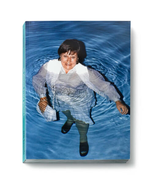
Erik then went on to talk about some of his side projects which often entailed finding bizarre pictures of people online or from flea markets and compiling them into books. One of them followed a lady who would have a photo taken of herself every year when she entered a local shooting competition and you could see her gradually ageing over time. You could also see the advancement of technology as the pictures started in black and white and gradually merged into colour.

The best of these side projects for me was a book he made when he stumbled across photos of a couple in Florida called Fred and Valerie. Fred had a slightly odd obsession with taking pictures of Valerie stood in water. The photos get more and more strange as the book goes on but it’s one of those things that really documents humans and their sometimes eccentric nature. He actually got to meet them too.

tumblr_inline_mfajfrKe0h1qa7w6z

Nath’s Highlights

Tomi Ungerer

Expectations were high for Tomi coming on stage, being introduced as a seminal illustrator whose work has influenced art and illustration throughout the 20th century. And he didn’t disappoint. At 83 years old he was helped on stage and was quick to say ‘I don’t normally do interviews, but I’ll probably die soon’ which set the scene for the rest of the interview.

tomi01

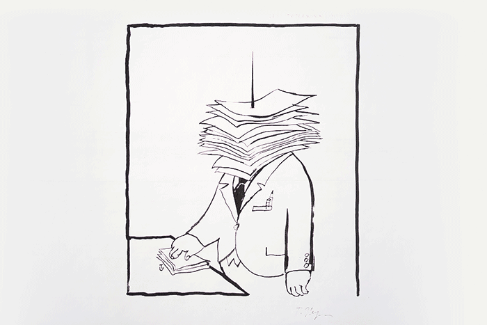
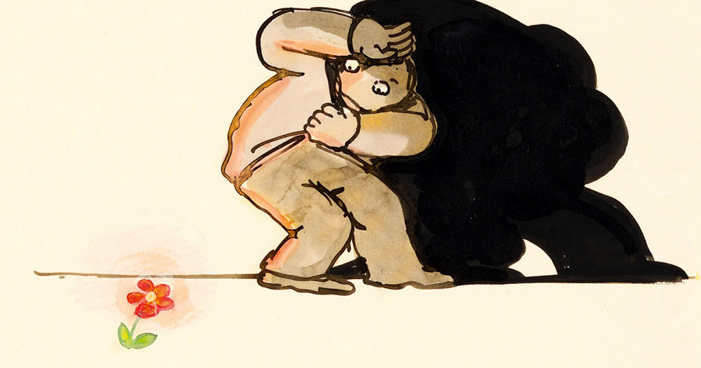
Touting himself as an agent provocateur he spoke about his early influences living in Nazi occupied France and growing up playing in tank filled fields with his sister and being brought up to fear nothing. Growing up with Nazi propaganda all around him it’s clear to see how this and his circumstances growing up has permeated his work. It’s difficult condensing his interview into a few paragraphs and nigh on impossible to communicate how charismatic and sharp he was on stage.

Admittedly, I never recognised the name but as a selection of his work cycled through on the screen behind him I certainly recognised his work. What’s more I saw how it has influenced other illustrators of his era and how his satire and controversial style continues to influence illustrators today.

tomi02

Johnny Kelly

One of the speakers I most looked forward to hearing was Johnny Kelly, a London based director/animator who has produced stunning work for brands like Dropbox, The Salvation Army and Chipotle. His talk was positioned as ’13 lessons I’ve learned…’  and begun along the lines of a clickbait article you might see on Buzzfeed.

296742941_1280x720

Whilst the ‘lessons’ occasionally sounded cliche (‘don’t get comfortable’), they acted as a nice platform to demonstrate them by showing relevant work and discussing his experiences. These were the bits I were eager to find out more about.

In all of the work shown, what underpinned them all were: great ideas, emotional resonance and perfect execution. His work for The Salvation Army for example was incredibly well executed and managed to communicate so much in so little time (just 15 second spots) whilst at the same time being such a simple idea. It’s this beautiful simplicity which is so effective when combined with great execution.

The Salvation Army – ‘Shelter’ from Nexus on Vimeo.


Andy’s Highlights

Seb Lester

The one underlying theme that I took away from the conference was the the art of ‘mastering your craft’ and that if you have a passion for what you do and genuinely enjoy doing it, this will come across in your work. Through years of refinement, Typographer Seb Lester has  ‘crafted’ his skill to a point that he can now effortlessly create hand drawn Letterforms like the example below:

What i also liked about his talk was that he came across as a very down to earth, funny guy with an almost modest approach to his skills. He talked through his early student work which was inspired by BMX’s and Drum and Bass and also his font Neo Sans which went on to be used by Intel – which he explained was pretty crazy as his work was then featured on millions (if not billions) of computers across the globe.

Neo Sans
Neo Sans

Neon Workshop Session

Seeing the light

Designers all need inspiration, it’s very easy to sit staring at your computer at the start of a project viewing the usual design websites like www.awwwards.com and  www.designspiration.net but I’m a firm believer in getting away from your screen and doing something completely different to be truly inspired. The design team have done some screen-printing and a bit of laser cutting down at inc.workshop in Leeds city centre in the past but when Nath pointed out the Neon Workshops Studio in Wakefield we thought we’d give it a go.


Neon Workshop Session

None of us had any experience of Neon at all so we opted for the 2 hour taster session which gave a really interesting history to Neon, the process by which it is made and some hands on experience of bending and moulding glass into some basic shapes.


What we learned

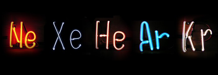
Neon gas was given its name from the Greek word ‘neos’ meaning ‘new’. It was a British invention but first used for advertising in Paris in 1912 and it soon found its way to America. We discovered that neon gas only actually makes one colour – red. All other colours of ‘neon signs’ are made using different gasses such as helium, xenon and mercury. They can be mixed or used on their own depending on the desired colour. You can also create coloured light by using coloured glass, but this is more expensive to source.

neon3Different noble gasses that can be used to make coloured neons. Source: Boundless.com
 

Task 1

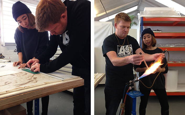
Our first task was to cut a thick piece of glass tube which we would then use to make a bend in, there were three types of bends to choose from. To cut the glass you had to make a score mark in it and then hold it out in front of you and snap it in half (most of use were covering our faces at this point) but despite us thinking that glass would shatter everywhere, it actually snaps clean in half!

neon-task-1 About to break the tube in half & then bend it into shape.
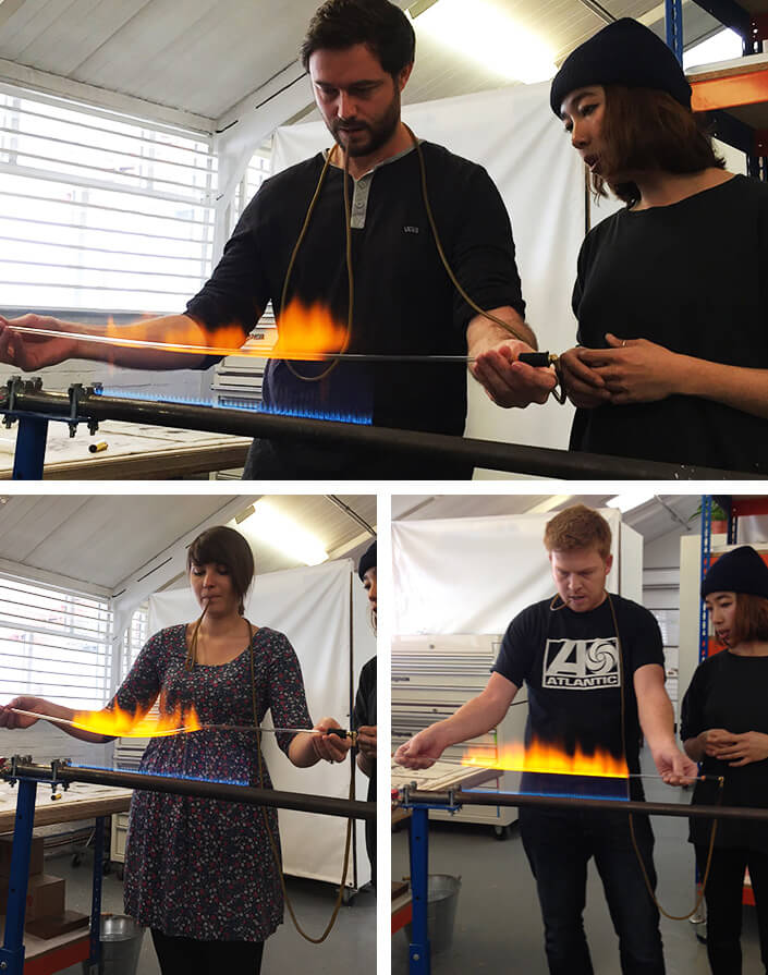
Then you had to take your tube and heat it over a bunsen burner. Once the glass began to melt you made the bend whilst gently blowing through the tube attached to the end – this was the ensure the middle of the tube didn’t collapse in on itself during the bending process. Then you had to flatten the tube on the bench whilst it was still a little hot. Lastly, you has to toast your tube lightly over the flame again to bring the temperature down slowly as not to shock it, otherwise it would just crack or break.


Task 2

Our second task was to make a ‘creative squiggle’ out of very thin tubing. Depending on the thickness of your neon tube determines which type of bunsen burner you should use. Because this tube was thin it meant using the ultimate bunsen burner – the ribbon.

The idea was to hold your tube over the line of blue flames until it created a strip of orange flames above it. Once you had it in the optimum position you would hold it there until the glass began to melt. It was a very strange experience as the glass began to sag in the middle and it was quite hard to control. Once it is flexible you would remove it from the flame and quickly create your shape before it cooled down again. You had to remember not to let the glass touch itself as this would make it venerable during the gas processing phase.

neon-workshop

The team about to make shapes as the glass begins to melt.

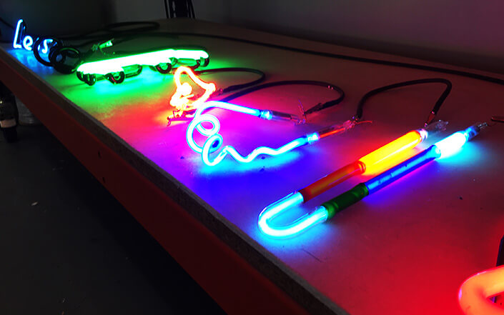
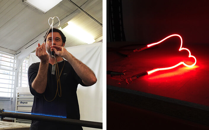
Some of us made more interesting shapes than others but were even all given the option of having our masterpieces filled with gas and illuminating with electricity to take home.

bending-glassNath bending his glass into shape.


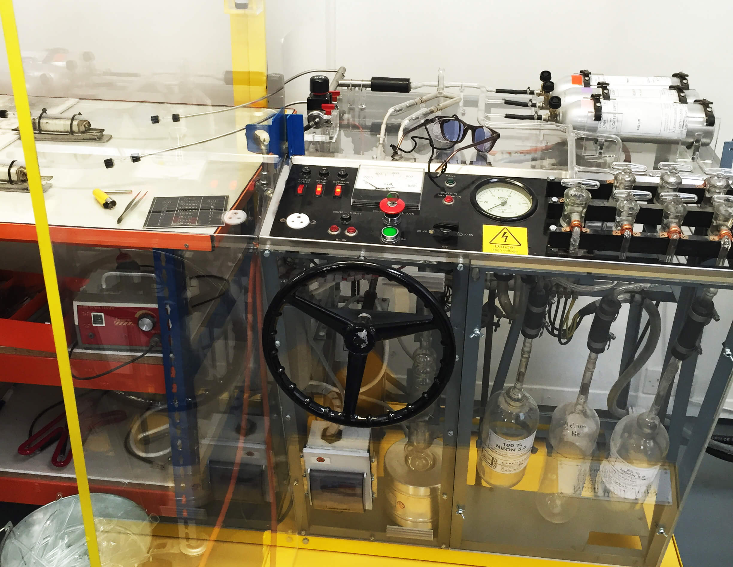
The electron bombarder

Yes it looks as cool as it sounds. This is the machine that is used to fill the glass tubes with gas and make them work. When a sign is finished, an electrode is melted to each end of the tube. All seals must be perfectly leak-proof to high vacuum before proceeding further. The electron bombarder is then used to draw out the air from 
the glass, create a vacuum and fill it with gas. An electric charge is then ran through it and hey presto! Neon light.

electron-bombarderThe electron bombarder.

Against most preconceptions, even though neon is high voltage and is really bright it only needs a tiny amount of electricity to run and lasts for decades.

neons

Finished Neons.

Playing About With Generative Typography

Playing with Processing

I’ve been looking more and more into how generative art and design can complement our workflow. Mainly out of interest but also out of looking for ways to improve and evolve my own creative development and technique.

My first experiments with typography were created using Processing, a Java based development tool.

I was first introduced to Processing at university as part of a games development module where it was used as a tool to get across low level programming principles and for this reason I (naively) never explored it further for the powerful tool I’m now finding it to be. 8 years on and I regret that I’m only now scratching the surface of how creative this field of can be.

Day in, day out I extensively use the usual array of designers tools like Photoshop and Illustrator and almost always have a good idea of how to bring to life a concept that starts out in my head. But I’m becoming evermore captivated by the possibilities of working generatively and seeing what can create itself given some rules and variables. By providing a ‘construct’ with some rules, variables and introducing a degree of randomness I’m always fascinated by what inevitably presents itself whether it be typography, colour or grids, these basic principles can apply to almost anything. And what can be even more interesting is when you can watch the artwork generating itself as with the experiments shown.

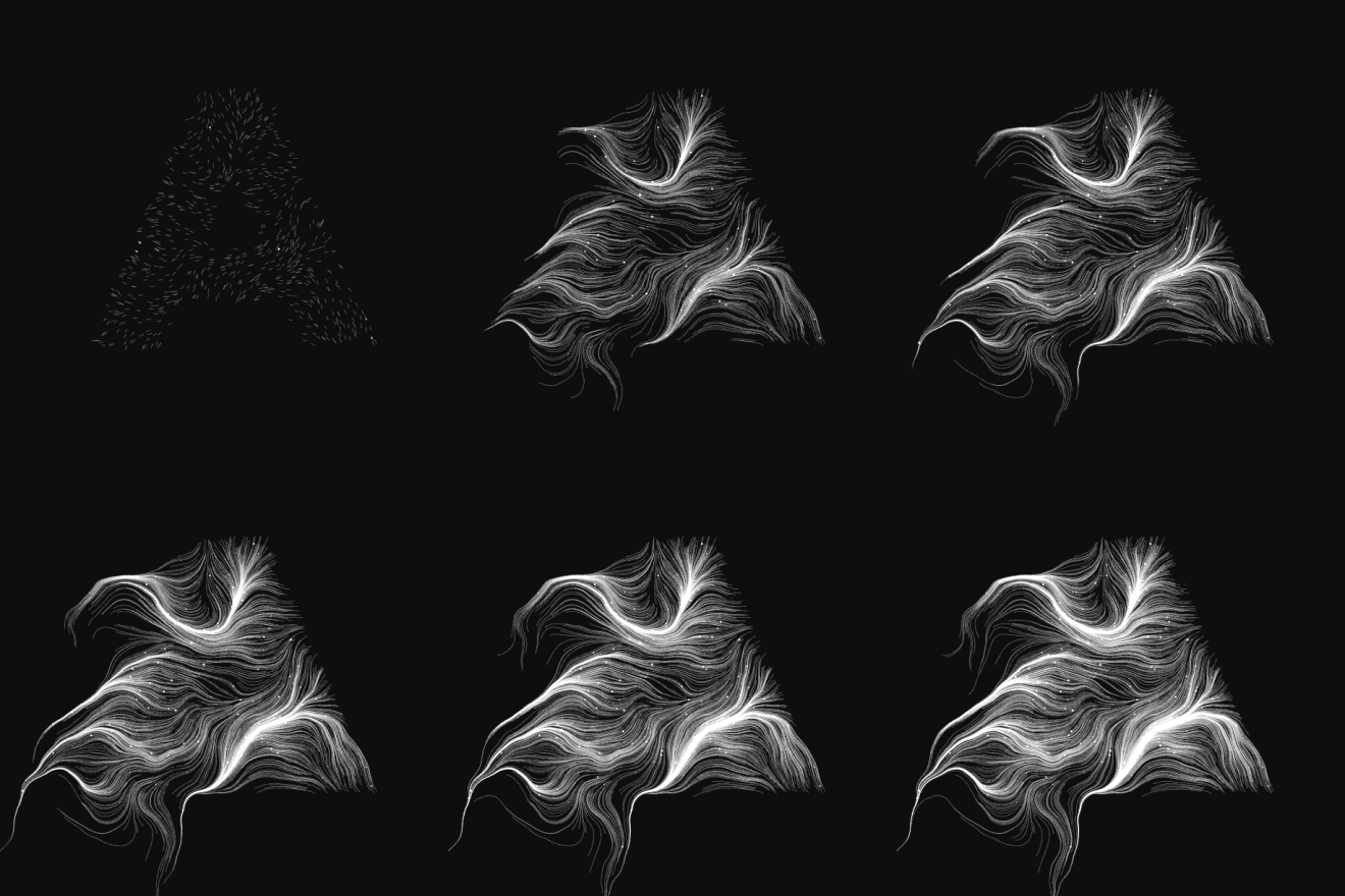
See for yourself

fieldflow

How it works

This particular experiment was based on a tutorial found on the internet for Processing and is based on:

  • Starting off with a black and white image of a single letter
  • Drawing (initialising) a set number of particles (800) at random points within the character
  • Setting a global rotation variable on each particle

And then on each frame after this initial ‘draw’ phase, moving each particle again based on some rules:

  • Using a noise pattern, assigning where the particle should draw itself next
  • The noise pattern spans the whole canvas and is what makes the visualisation really interesting, especially when watching it generate. It applies randomness but does it in a global space in relation to the canvas which creates the ‘swarming’ effect, resulting in the particles eventually flowing into fewer and fewer streams.
  • Other variables include the global rotation which adds a bit more randomness to the movement of the particles as they swarm and the life of a particle which sets how long the particles run for

Using this particular tool for this particular purpose isn’t a new idea but with the recent interest in things like the mindblowing DeepDream project that Google recently opened up and seeing how the internets have used it to come up with sometimes nightmarish imagery, generated by an infinitely more complex algorithm than that which generated my poxy A. It’s an exciting field to play in and this type of experimenting and learning more often than not leads to fresh ideas and new insight which feeds directly back into our creative work.

A few examples of how it was taken further.

A S