The Big Smoke
We were lucky enough to head down to the Offset London 2015 design conference last week and not just one of us – the whole design team! It was set in super hipster Shoreditch, at the town hall and we decided to make like the locals and rent a trendy pad from airbnb for the night. As you can imagine there were beards and skinny jeans everywhere. With a wealth of inspiring speakers we were excited to get going.
Anna’s Highlights
McBess
What I found great about McBess was not only his inspiring illustrations, but he is very straight forward and funny. He opened his presentation with a quote from himself which simply said ‘I like drawing’ – McBess 2015. It is clear that he truly enjoys his craft and mentioned that all his work contains one of three themes – music, food or girls. A simple man.

His illustrations are very complex and can take a very long time to create and it really shows. In his presentation he said “I try to find a way to make the work a challenge, harder to draw.” I suppose when you do something day in day out you can become comfortable and its great to push yourself even when you find something easy. 99% of his work is black and white but he has on very rare occasions strayed into colour.
Mcbess is part of the band ‘The Dead Pirates’ and as a keen animator he created a music video with his friend Simon Landrein for the single ‘Wood’ which has gathered hundreds of thousands of views online. The video took four months to make but the result is brilliant and well worth a watch.
Erik Kessels
Erik Kessels is co-founder and Creative Director of the agency KesselsKramer, based in Amsterdam who are known for their risky approach to advertising. In his presentation he talked us through some of their projects and also a few of his own side projects.
The piece of work that stood out for me was the branding and advertising project they completed for a budget hotel in Amsterdam called Hans Brinker. Hans Brinker is the sort of place you might stay if you were on a stag do and it was constantly getting complaints for the state it was in. KesselsKramer took the idea of these complaints and rather than using the usual advertising method of trying to make it look amazing, they created a brutally honest campaign that ended up getting the hotel huge numbers of new customers who now complain that it isn’t bad enough!

Erik then went on to talk about some of his side projects which often entailed finding bizarre pictures of people online or from flea markets and compiling them into books. One of them followed a lady who would have a photo taken of herself every year when she entered a local shooting competition and you could see her gradually ageing over time. You could also see the advancement of technology as the pictures started in black and white and gradually merged into colour.
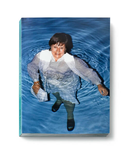
The best of these side projects for me was a book he made when he stumbled across photos of a couple in Florida called Fred and Valerie. Fred had a slightly odd obsession with taking pictures of Valerie stood in water. The photos get more and more strange as the book goes on but it’s one of those things that really documents humans and their sometimes eccentric nature. He actually got to meet them too.
Nath’s Highlights
Tomi Ungerer
Expectations were high for Tomi coming on stage, being introduced as a seminal illustrator whose work has influenced art and illustration throughout the 20th century. And he didn’t disappoint. At 83 years old he was helped on stage and was quick to say ‘I don’t normally do interviews, but I’ll probably die soon’ which set the scene for the rest of the interview.
Touting himself as an agent provocateur he spoke about his early influences living in Nazi occupied France and growing up playing in tank filled fields with his sister and being brought up to fear nothing. Growing up with Nazi propaganda all around him it’s clear to see how this and his circumstances growing up has permeated his work. It’s difficult condensing his interview into a few paragraphs and nigh on impossible to communicate how charismatic and sharp he was on stage.
Admittedly, I never recognised the name but as a selection of his work cycled through on the screen behind him I certainly recognised his work. What’s more I saw how it has influenced other illustrators of his era and how his satire and controversial style continues to influence illustrators today.
Johnny Kelly
One of the speakers I most looked forward to hearing was Johnny Kelly, a London based director/animator who has produced stunning work for brands like Dropbox, The Salvation Army and Chipotle. His talk was positioned as ’13 lessons I’ve learned…’ and begun along the lines of a clickbait article you might see on Buzzfeed.
Whilst the ‘lessons’ occasionally sounded cliche (‘don’t get comfortable’), they acted as a nice platform to demonstrate them by showing relevant work and discussing his experiences. These were the bits I were eager to find out more about.
In all of the work shown, what underpinned them all were: great ideas, emotional resonance and perfect execution. His work for The Salvation Army for example was incredibly well executed and managed to communicate so much in so little time (just 15 second spots) whilst at the same time being such a simple idea. It’s this beautiful simplicity which is so effective when combined with great execution.
The Salvation Army – ‘Shelter’ from Nexus on Vimeo.
Andy’s Highlights
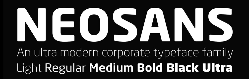
Seb Lester
The one underlying theme that I took away from the conference was the the art of ‘mastering your craft’ and that if you have a passion for what you do and genuinely enjoy doing it, this will come across in your work. Through years of refinement, Typographer Seb Lester has ‘crafted’ his skill to a point that he can now effortlessly create hand drawn Letterforms like the example below:
What i also liked about his talk was that he came across as a very down to earth, funny guy with an almost modest approach to his skills. He talked through his early student work which was inspired by BMX’s and Drum and Bass and also his font Neo Sans which went on to be used by Intel – which he explained was pretty crazy as his work was then featured on millions (if not billions) of computers across the globe.
by tomw