A product is only as good as its ability to adopt behaviour

The internet is overloaded with the remains of once beautiful products that were executed to perfection, but failed to gain any traction from users. They failed to fit into, or change, the behaviour patterns of their users.
This raises the question: Why?
When a behaviour or an action doesn’t occur, it tends to be because one of more of the three following things is missing or lacking.
– Motivation, the desire.
– Ability, the skills.
– Trigger, the prompt.
For a behaviour to occur, a person must be first motivated and able to perform the behaviour. If they have the motivation and the ability to perform the given behaviour, they will when this behaviour is triggered or prompted.
This is the basis for the Fogg Behavior Model.
The three elements can be broken down further into a lot more depth, however let’s keep at this top level and use the example behaviour of physical exercise, that hour a day we all struggle with.
I did plan on going to the gym yesterday, sadly I didn’t.
But Why?
I could have forgotten to go. I might have been desperately trying to finish of the final season of Breaking Bad before I get told any more spoilers. In this example the behaviour wasn’t completed due to a lack of a trigger or a prompt.
Or, I might now have gone to the gym as I went out with friends the night before and was feeling completely shattered when I got home. In this case the behaviour wasn’t performed due to a lack of ability, the skills.
Or, If I’m being honest I might not have gone, simply because I haven’t got the desire to go, the behaviour in this case wasn’t completed due to a lack of motivation.
So, if you’re looking at a behaviour, such as updating your status on Facebook, we need to identify where the problem lies. In most behaviours all three elements are somewhat to blame. However usually theres a single element that stands out, a behaviour bottleneck that must be resolved.
Just a little push, the trigger

After working on a series of apps revolving around user behaviours, the bottleneck tends to lie with the trigger.
The can be broken down into 2 main categories; Internal and External.
An internal trigger is created when a user has a great experience with the app. An association is made between the app and the need of opening said app. For example the trigger for opening Twitter could be “that’s interesting. I need tell people about this”. For Instagram it could be “that that looks cool, I’m going to take a photo”. Or a personal favourite Vouchercloud “Is there anywhere nearby I can dine at a discount”. Internal triggers tap into our needs, desires and curiosity and therefore are impossible to measure or rely upon. Hence the reason why external triggers are a designers best friend.
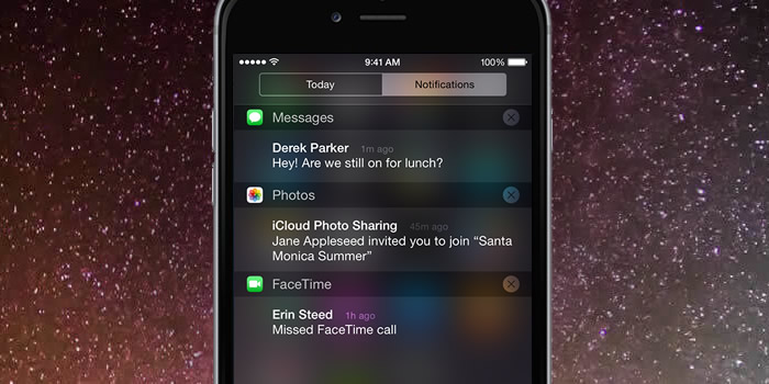
External triggers take many forms. From; Emails, notifications, adverts, complimentary products and ‘text messaging’ to name a few.
As in web design, if a user is presented with a call to action when they are able and motivated (even remotely) to perform a behaviour, it’s likely a majority will. If once ‘in’ the app, they have a good experience, they will be reinforced to use it again in the future. Need = Solution. If the app fills this requirement enough times a habit is formed.
Companies such as Twitter have relied on external triggers to build habits into their users. The end goal is to get your users to think about your app as much as possible.
This ultimately increases the probability of the users opening the app and building the association between the app and the ‘use’ it has on a day to day basis.
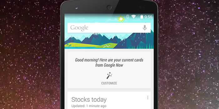
For example something that Google are working on with Google Now. Notifications that aim to aid and guide me on a day to day basis. Notifications saying: Need something? just type or talk here. Want to get home? Use this bus route. You’re near a popular restaurant, take a look at the menu. Your going to need your jacket tomorrow, check out the weather.
This strategy surely helps build a habit between an ‘app’ and a user as it doesn’t require the user to be taught a new behaviour. It evolves around their current ones.
This tactic also helps curve the current smartphone behavioural dynamics, where people are often overwhelmed by the number of apps they have. Your app will likely be one of 50 or even a 100 and it’s also incredibly likely that you’re one a group of new apps installed that week. Therefore if your not front and centre, in the users field of view (as a widget for example) it’s likely you’re going to become forgotten.
This is why external triggers are vital to the development of an app. They remind the user that the app can serve a purpose to them and when they might need it. Triggers can seem annoying in principle, but that’s not necessarily true for the user. As a user we want them to be constantly thinking about the app, therefore they shouldn’t be surprised or excited to see one. This is why it is difficult to identify harmful/annoying notifications to the user. The best approach is to simply carry out research in the real world to evaluate their reach,success and effectiveness.
As with any form of notification there is always a threshold above which uninstall / unsubscribe rates sky rocket. However up until that point, the more triggers the better when trying to establish a behaviour.
They have the Skills, the ability

If the initial trigger isn’t the bottleneck, the second offender to tackle is ability. If an app is difficult to use, people won’t bother and will simply move on to a simpler alternative.
Ability is all about usability and fine tuning this to ensure a silky smooth experience, underpinned via user testing.
Ability is broken down by Fogg into 6 sub-categories; time, money, cognitively demand, physically demand, social deviance and non-routine. These form ‘road-blocks’ that can get between the behaviour and the user. For example does a behaviour demand a lot of time or money? This will result in the user having a low ability to perform it and so on.
Out of the 6 sub categories i’d argue the most important is the time it takes to complete said task. If a task is quick to complete chances are it’s not cognitively or physically demanding and doesn’t require a change to the users routine. Therefore this a good guide whether the app is usable and understandable.
Desire and motivation

This splits into two levels; app wide and screen level.
App-wide motivation refers to the problem/use-case of the app. For example, I’ve been tasked with optimising the usage/retention of an app that allows MadeByPi staff to vote for their optimal shade of white paper for the printer. I could implement an endless amount of triggers and make it amazing to use, however, who really cares? It’s an app that solves a problem that nobody has or cares enough about. Therefore, the level of motivation for this behaviour is so low that no amount of triggers and gamification can help.
When creating an app, you need to ask, do people really care about this and is it a problem people have?
I’d argue in the tech start up world where apps are instantly valued at billions, that this is rarely asked.
So, the app solves a problem a lot people have, how can we take the idea and add additional motivation?
Again there’s a lot of tactics we could employ. However a key starting point are the incentive systems. These can be broken down in four main categories; monetary, tangible, point-based and social.
Monetary and tangible are straight forward.
Point-based are in app ‘currency’. These could be frequent flyer miles or even fictional currencies found in many popular AAA games titles. Points are a cornerstone in the gamification world. Adding an additional hook in the short term, but not without issues in the long term. An example would be original Foursquare. Adding points based upon ‘check-ins’ to become a Town Major. The issue is the game ceiling to how achievable / out of reach this is. Too easy to progress and it becomes boring, too difficult and it becomes too daunting to the user.
Social rewards are arguably the most powerful and friendly in the long term. Beyond all the layers of technology we are social beings. With have the ability to read others, understand social hierarchy / ties and the ability to gain favour from others. These skills have arguably been vital to the evolution of the human race and because of this we have an extremely powerful interest in other people and desire for their recognition.
Enter Facebook… An app that gains you social recognition and attention (with the people you already know) feels compelling and rewarding an a deep instinctual level.
Incentive systems are not the only way that you can increase the motivation of your users. A beautifully designed and elegant experience is another way that we can reward them.
The small delightful interactions (visual and sound) that are often looked over by companies due to time/budget constraints often make the difference. We all have our favourite sound or interaction, mines SoundHound’s ability to listen to a song and add it instantly into my Spotify playlist. What’s yours?
by tomw