The future of UI isn’t flat, 2.0, material or burger based

I remember arriving at my interview with MadeByPi and discussing the future of UI and the case study of how people use Google to search.

Let’s hypothetically say I needed to access information about the flu and whether I’d be entitled to a free vaccination on the NHS.

Would I navigate onto the NHS website, use their menu or internal search to find the page I need. Probably not. I’d simply ‘Google’:

“NHS flu vaccinations requirements”

Then I’d judge the results to quickly find the appropriate page, click, and then consume the information I want. Well, what if I could send a message and find out if I am entitled to the vaccination and receive a reply with the answer and whether I wanted to book the next available appointment near me. All through a couple of messages, without ever having to use a ‘website’.

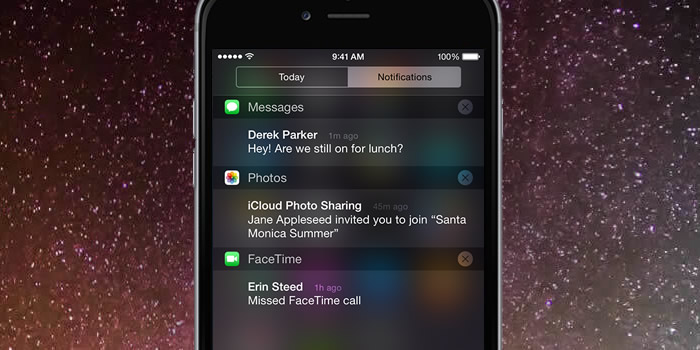
Enter Magic, Operator and the soon to be Facebook M. These ‘invisible’ or ‘conversational’ apps revolve around a single messaging screen.

Matti Makkonen was a software engineer and an unsung hero of modern life: He invented the SMS. This ‘technology’ is the most used application in the world. Three years ago it had an estimated 4 billion active users, which at the time was 4 times the amount of Facebook. Messaging in whichever form is a fundamental form of human communication that is reflected in the sky-high valuations of apps such as WhatsApp and WeChat.

Currently sat at work, if I want to communicate with the member of the team I’d message them on Skype, if I wanted to plan a night out with friends I’d send a group message on WhatsApp or if I wanted to moan at poor service from a company I’d probably take to Facebook or Twitter to vent. So while messaging has become a cornerstone of personal communications it hasn’t ever been fully implemented beyond that. What if messaging could transform the way be interact with computers, in the same way way we interact with each other?

“I’ve seen things you people wouldn’t believe”

Have you ever used a live chat on a website and wondered whether you are speaking to a machine or a person? Have you ever tried to throw some curve balls into the conversation to try and tell them apart?

This is us carrying out the Turing Test. A test invented by Alan Turing, the man who successfully cracked the unbreakable; the Enigma machine. He created the test to prove if there was such a thing as AI and how to identify it. The test revolves around a subject (a human) having a conversation with another ‘party’ (a machine). If at the end of that conversation the subject believed they were having a conversation with a person, the machine passes and true AI is born. This subject is tackled by a multitude of different Si-Fi movies from Blade Runner to more recently Ex-Machina.

While a replicant or a robot such as Ava is a long way away, we have got robots that are good at simulating humans in narrow contexts. One of those contexts in particular is messaging. This is thanks to a process called deep learning, where a computer is taught to understand and solve a problem by itself, rather than needing engineers to code a response. Therefore messaging is the golden ticket into the realm of AI as it doesn’t carry the additional baggage of other forms of communication such as accents or physical gestures.

Furthermore messaging makes for a great user experience rather than a traditional app as it feels natural and familiar. When messaging becomes the UI, the user doesn’t need menus, buttons, labels, filters and pagination. This explains the current rise in popularity of Invisible and Conversational apps, but the reason why we should take note goes beyond that.

You could argue that Conversational apps have a UI; they work via a screen and need a chat interface that currently might point the user to a conventional ‘website’. But we are at the tip of an iceberg, take a look at these videos:


Key note for both. Neither require a UI for computer input.

As a designer this is a shocking trend to realise. In a future where a computer can see, listen, talk, understand and reply to you, what is the purpose of a UI? Why bother making an app to book a holiday, when I can just communicate it with it directly? Welcome to the world of Brain-Computer Interaction. A world of Digital-Telepathy coupled with AI, removing the need for a screen.

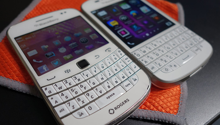
Are we approaching a new technological tiller? A concept originally introduced by Scott Jenson in 2014. A technological tiller is when we hamper new technology by applying an old design. For example I’d argue the original Blackberry’s having a standard physical buttons rather than being part of a touch screen was a technological tiller from the days of the trustworthy Nokia 3210.

Blackberry phone

What if a screen becomes the next technology tiller? And what if good design becomes avoiding a screen all together?

The new start ups developing Invisible and Conversational apps champion this principle. They push the concept of the product been the service and the UI/screen, simply the medium. If the screen becomes unnecessary or a better medium arrives (VR for example), that offers a better experience, then it should definitely evolve.

So what now for UI designers?

Is UI obsolete and AI the future? No, I don’t think thats the case. What I do believe though is just how responsive designs changed the face of web. New technology will force change once again and designers we will have to adapt and evolve with the technologies on offer. Currently a ‘screen’ in one form or another (VR, Wearable tech; Google Glass and even Apple TV) will still be around for a while. All ‘mediums’ pose different design problems to solve. However in the future you could argue design will become infinitely more invested in UX as we find innovative ways to interact with our replicant friends and UI’s become rarer in their traditional form.

Using UX principles to underpin a product

During my digital career I’ve done the Hokey Cokey between being predominantly a UI or UX designer. I often get asked what’s the difference between the two. In my experience, there’s a lot of cross-overs between the two, with the noticeable difference being that of focus. Working in the teams I have; a UI designer is primarily focused on creating a interface thats aseptically pleasing. Fairly straightforward. Whereas a UX designer has to create from the mind-space of a user. Predicting patterns, goals, needs and flagging potential issues in the usability of the product.

When tackling virtually any project I usually ask myself a series of questions to help guide the design process.
Understanding and maintaining these principles for the full life cycle of the project WILL result in a more successful final product.

Is it easy to digest?

The user journey should be broken down to give the user performable tasks, without unnecessary fragmentation. We are wanting to simplify the task without it feeling diluted and clumsy.

This should be go far beyond easy-to-read copy. The process starts with IA, site maps and user journeys. Ensuring content can be found where a user would expect and it’s well presented utilising functionality and layout options.

Don’t forget user’s need guidance. Sometimes they need a helping hand to reach their end goal and remember to offer multiple routes to get to that point. For example offering them a sub navigation with 10+ similar pages could becoming daunting and confusing trying to find the specific content they require.

Consider every decision a user has to make to get to the bottom of the funnel.

Does it communicate a clear message?

Aside from communicating your value proposition, you need the user to understand the actual value of using your product. Be clear and upfront about your product, offer the user all the information they need to make an educated decision.

Linked to value, pricing is an area where being clear is vital. Users simply won’t ‘buy’ if they can’t figure out the true cost. If you need to hide the cost, there’s probably a reason.

As simple as it sounds, imagine you were browsing the product for the first time. What would you want to know? How would you want to be told?

Trust & reward?

A cohesive design is a great way to build trust. Before requiring the user to complete any action, inform them why the task is needed (the reward). These clear explanations help build trust at each step, leading to easier conversions further along the funnel.

Take Uber for instance. Getting a taxi is now easier than ever, resulting in the ‘traditional’ industry becoming increasing unsettled. The App requires payment information for instance. This further down the line allows for quick and safe payments to be made. A task (entering payment information) that has a clear goal and end result for the user. Always offer the user a reason a complete a task and sign-post their progress through it.

Building trust and rewarding the user with additional functionality should create an invisible experience. As decisions (user journeys) require less time and mental/physical resource. Thus using the product becomes easier and more enjoyable to use.

Original, but familiar?

Awe-inspiring design is great, but design that doesn’t convert could be considered art. Impressive CSS animations and rich multi-media experiences might look great but if no-one can navigate to their goal it’s pointless. Aim to utilise web standards where possible to ensure a smooth user journey. Does a button draw the users eye and look clickable?

As simple as possible?

It’s incredibly rare to offer a product that has no competition. Therefore execution of said product is arguably just as important. As a general rule, the simpler you can make a complex problem or task, the more enjoyable it is for the user. The ultimate goal should be to become a benchmark, when a user forgets it’s a ‘product’ and simply see’s it as a useful tool to achieve said goal.

Be the user

Consider every aspect; their age, physical and mental ability, interests, state of mind, environment and goals. Be thoughtful and show you care. It’s important as 68% of users give up if they think your product hasn’t being tailored to them.

Designing for People

A product is only as good as its ability to adopt behaviour

blog - designing for people - 1

The internet is overloaded with the remains of once beautiful products that were executed to perfection, but failed to gain any traction from users. They failed to fit into, or change, the behaviour patterns of their users.

This raises the question: Why?

When a behaviour or an action doesn’t occur, it tends to be because one of more of the three following things is missing or lacking.

– Motivation, the desire.
– Ability, the skills.
– Trigger, the prompt.

For a behaviour to occur, a person must be first motivated and able to perform the behaviour. If they have the motivation and the ability to perform the given behaviour, they will when this behaviour is triggered or prompted.

This is the basis for the Fogg Behavior Model.

The three elements can be broken down further into a lot more depth, however let’s keep at this top level and use the example behaviour of physical exercise, that hour a day we all struggle with.

I did plan on going to the gym yesterday, sadly I didn’t.

But Why?

I could have forgotten to go. I might have been desperately trying to finish of the final season of Breaking Bad before I get told any more spoilers. In this example the behaviour wasn’t completed due to a lack of a trigger or a prompt.

Or, I might now have gone to the gym as I went out with friends the night before and was feeling completely shattered when I got home. In this case the behaviour wasn’t performed due to a lack of ability, the skills.

Or, If I’m being honest I might not have gone, simply because I haven’t got the desire to go, the behaviour in this case wasn’t completed due to a lack of motivation.

So, if you’re looking at a behaviour, such as updating your status on Facebook, we need to identify where the problem lies. In most behaviours all three elements are somewhat to blame. However usually theres a single element that stands out, a behaviour bottleneck that must be resolved.

Just a little push, the trigger

blog - designing for people - 2

After working on a series of apps revolving around user behaviours, the bottleneck tends to lie with the trigger.

The can be broken down into 2 main categories; Internal and External.

An internal trigger is created when a user has a great experience with the app. An association is made between the app and the need of opening said app. For example the trigger for opening Twitter could be “that’s interesting. I need tell people about this”. For Instagram it could be “that that looks cool, I’m going to take a photo”. Or a personal favourite Vouchercloud “Is there anywhere nearby I can dine at a discount”. Internal triggers tap into our needs, desires and curiosity and therefore are impossible to measure or rely upon. Hence the reason why external triggers are a designers best friend.

External triggers take many forms. From; Emails, notifications, adverts, complimentary products and ‘text messaging’ to name a few.

As in web design, if a user is presented with a call to action when they are able and motivated (even remotely) to perform a behaviour, it’s likely a majority will. If once ‘in’ the app, they have a good experience, they will be reinforced to use it again in the future. Need = Solution. If the app fills this requirement enough times a habit is formed.

Companies such as Twitter have relied on external triggers to build habits into their users. The end goal is to get your users to think about your app as much as possible.

This ultimately increases the probability of the users opening the app and building the association between the app and the ‘use’ it has on a day to day basis.

For example something that Google are working on with Google Now. Notifications that aim to aid and guide me on a day to day basis. Notifications saying: Need something? just type or talk here. Want to get home? Use this bus route. You’re near a popular restaurant, take a look at the menu. Your going to need your jacket tomorrow, check out the weather.

This strategy surely helps build a habit between an ‘app’ and a user as it doesn’t require the user to be taught a new behaviour. It evolves around their current ones.

This tactic also helps curve the current smartphone behavioural dynamics, where people are often overwhelmed by the number of apps they have. Your app will likely be one of 50 or even a 100 and it’s also incredibly likely that you’re one a group of new apps installed that week. Therefore if your not front and centre, in the users field of view (as a widget for example) it’s likely you’re going to become forgotten.

This is why external triggers are vital to the development of an app. They remind the user that the app can serve a purpose to them and when they might need it. Triggers can seem annoying in principle, but that’s not necessarily true for the user. As a user we want them to be constantly thinking about the app, therefore they shouldn’t be surprised or excited to see one. This is why it is difficult to identify harmful/annoying notifications to the user. The best approach is to simply carry out research in the real world to evaluate their reach,success and effectiveness.

As with any form of notification there is always a threshold above which uninstall / unsubscribe rates sky rocket. However up until that point, the more triggers the better when trying to establish a behaviour.

 They have the Skills, the ability

blog - designing for people - 4

If the initial trigger isn’t the bottleneck, the second offender to tackle is ability. If an app is difficult to use, people won’t bother and will simply move on to a simpler alternative.

Ability is all about usability and fine tuning this to ensure a silky smooth experience, underpinned via user testing.

Ability is broken down by Fogg into 6 sub-categories; time, money, cognitively demand, physically demand, social deviance and non-routine. These form ‘road-blocks’ that can get between the behaviour and the user. For example does a behaviour demand a lot of time or money? This will result in the user having a low ability to perform it and so on.

Out of the 6 sub categories i’d argue the most important is the time it takes to complete said task. If a task is quick to complete chances are it’s not cognitively or physically demanding and doesn’t require a change to the users routine. Therefore this a good guide whether the app is usable and understandable.

Desire and motivation

blog - designing for people - 3

This splits into two levels; app wide and screen level.

App-wide motivation refers to the problem/use-case of the app. For example, I’ve been tasked with optimising the usage/retention of an app that allows MadeByPi staff to vote for their optimal shade of white paper for the printer. I could implement an endless amount of triggers and make it amazing to use, however, who really cares? It’s an app that solves a problem that nobody has or cares enough about. Therefore, the level of motivation for this behaviour is so low that no amount of triggers and gamification can help.

When creating an app, you need to ask, do people really care about this and is it a problem people have?

I’d argue in the tech start up world where apps are instantly valued at billions, that this is rarely asked.

So, the app solves a problem a lot people have, how can we take the idea and add additional motivation?

Again there’s a lot of tactics we could employ. However a key starting point are the incentive systems. These can be broken down in four main categories; monetary, tangible, point-based and social.

Monetary and tangible are straight forward.

Point-based are in app ‘currency’. These could be frequent flyer miles or even fictional currencies found in many popular AAA games titles. Points are a cornerstone in the gamification world. Adding an additional hook in the short term, but not without issues in the long term. An example would be original Foursquare. Adding points based upon ‘check-ins’ to become a Town Major. The issue is the game ceiling to how achievable / out of reach this is. Too easy to progress and it becomes boring, too difficult and it becomes too daunting to the user.

Social rewards are arguably the most powerful and friendly in the long term. Beyond all the layers of technology we are social beings. With have the ability to read others, understand social hierarchy / ties and the ability to gain favour from others. These skills have arguably been vital to the evolution of the human race and because of this we have an extremely powerful interest in other people and desire for their recognition.

Enter Facebook… An app that gains you social recognition and attention (with the people you already know) feels compelling and rewarding an a deep instinctual level.

Incentive systems are not the only way that you can increase the motivation of your users. A beautifully designed and elegant experience is another way that we can reward them.

The small delightful interactions (visual and sound) that are often looked over by companies due to time/budget constraints often make the difference. We all have our favourite sound or interaction, mines SoundHound’s ability to listen to a song and add it instantly into my Spotify playlist. What’s yours?