Case for design
Improving the reach of sports & activities to the people of Yorkshire.
Yorkshire Sport is a charitable foundation that strive to empower communities by actively engaging people in sports and activities. They provide a funding and founding starting point for groups and individuals who are looking to establish sports teams, or offer activities that others can engage in and enjoy. We worked together to completely overhaul and rethink Yorkshire Sport’s online presence, bolstering the adoption and immersion of sports and activities across the region.

Rethinking the user experience.
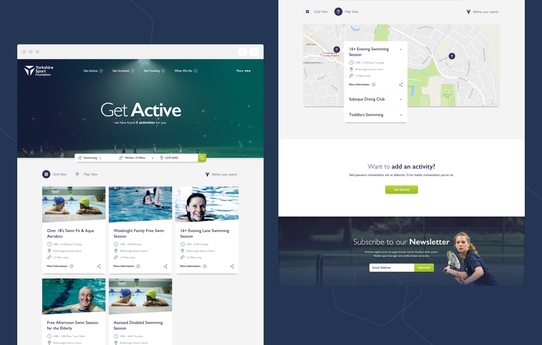
Extensive user research and analytics provided a detailed insight into the behaviour of Yorkshire Sport’s user base. We discovered that the website was delivering what the organisation wanted and not necessarily what the user needed. We decided to start with a completely blank canvas and designed a solution that put the user first and foremost. A majority of the site’s visitors were digging through pages in an attempt to search for sports or activities, with no real means to do so quickly or clearly. Putting search at the centre of the new site structure meant that we could deliver a solution that catered for the users primary need, enhancing the user experience and delivering the content that they want quickly and accurately.
Search is at the heart.
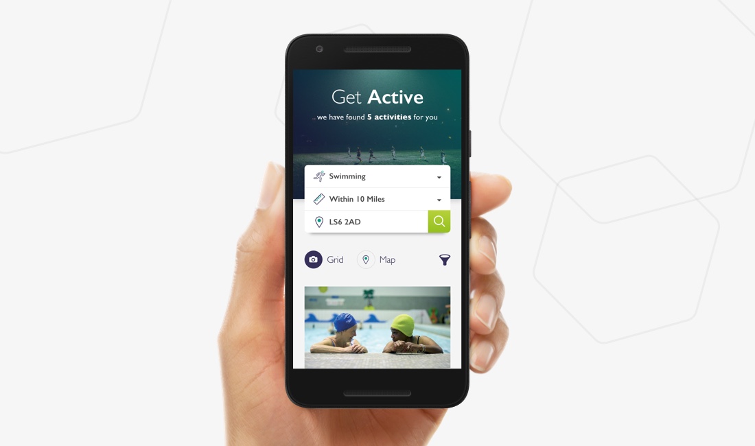
Motivating a county to engage in sports and activities is quite a challenge and it presents a somewhat problematic situation for design. Our research proved that people wanted to find an activity or seek inspiration fast. We arrived at a solution that puts search at the heart of the user experience, providing instant access to hundreds of sports and activities that meet the user’s specific criteria. We introduced the ability to search for activities by location and filter results on an area radius. In the case that no activities met the user’s search criteria, we present similar activities that the user might be interested in, or expand their search radius depending on the particular activity that they are searching for.


Mobile first.
Maintaining consistency across devices and screen sizes is critical to providing the best possible user experience. We approached the design from a mobile first stance to ensure that the finished product delivered a great experience to the site’s visitors, no matter how they chose to access the site. Working within the confines of a smaller screen size, we were able to focus on the mission critical aspects of the site. Search, structure and content had to be re-imagined and optimised.
Card based UI.
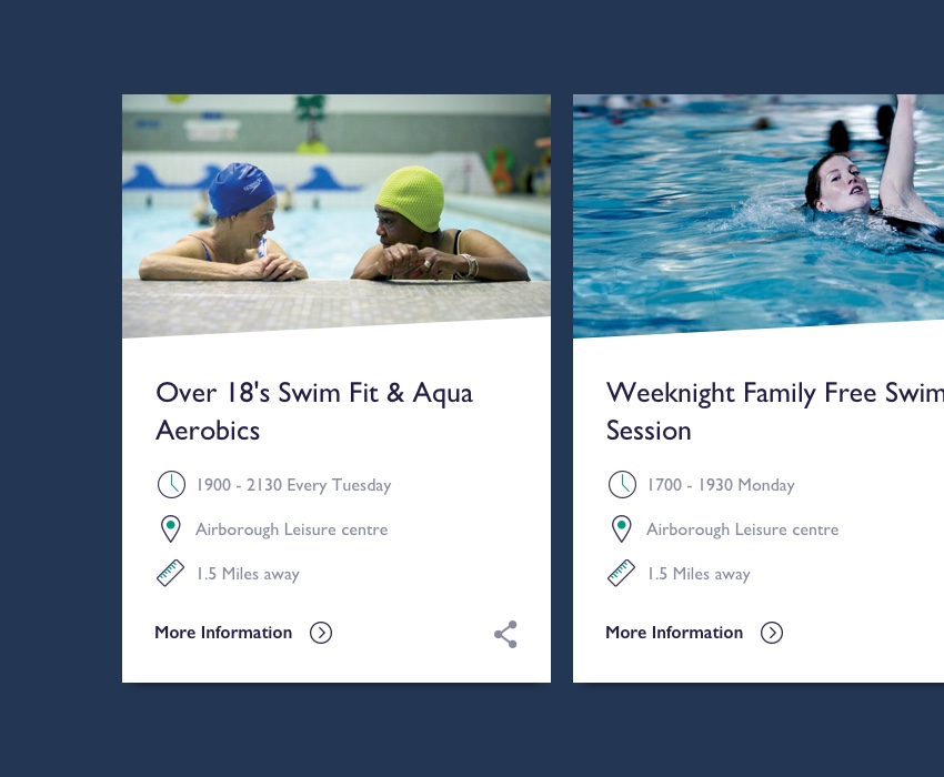
A card based user interface provided the most convenient means to organise and present content across a plethora of devices. The logic behind the cards is simple and effective:- Provide the user with a concise overview of an activity at a glance. On mobile devices, cards can be swiped to the left or the right and tapped to reveal activity details. On larger screens and desktop, the cards simply stack together in a grid system, providing greater oversight and a thrifty navigation experience.

