Could CUI (Conversational User Interface) be the future of a great online user experience? Let’s explore an idea where we talk our way around, rather than clicking and tapping through menus and lists.
The digital industry is in a really exciting position at the moment. Never before has there been so many creative avenues to explore and immerse yourself in. UX design has splayed out into an entire plethora of unique and specialist roles, that cover everything from behavioural study through analytics and user testing, to corporate strategy, rapid prototyping and design iteration.
UI design channels creativity in two particular directions. On one end of the scale, atomic design patterns and principles create a uniform experience across connected sites and services, where as at the polar opposite, we have UI designs that are completely experimental, flamboyant and uncharted.
So in this time of booming specialism and creativity, why is our overarching experience online still the same?

It’s a thought I’ve been mulling over for several months. Let me explain my line of thought to put my statement into context. Generally speaking, I browse the web for all sorts of different reasons. I might be scouring Amazon for camping gear and car parts, keeping on top of all the latest tech on The Verge, or looking through Land-book or Muz.li for design inspiration. In any scenario, my mind is in one of two states: I either know what I’m looking for, or I don’t.
A majority of the time, I find myself skimming through an abundance of irrelevant content to get to the material that I am actually interested in. It’s a feeling similar to shuffling through my mail at home. There’s always a huge pile of junk and only a couple of envelopes that bare any relevance to my interests. What if we could cut through the noise, obliterate cumbersome navigation structures and actually get to the content that we want, when we want to see it?
It all starts with a conversation.
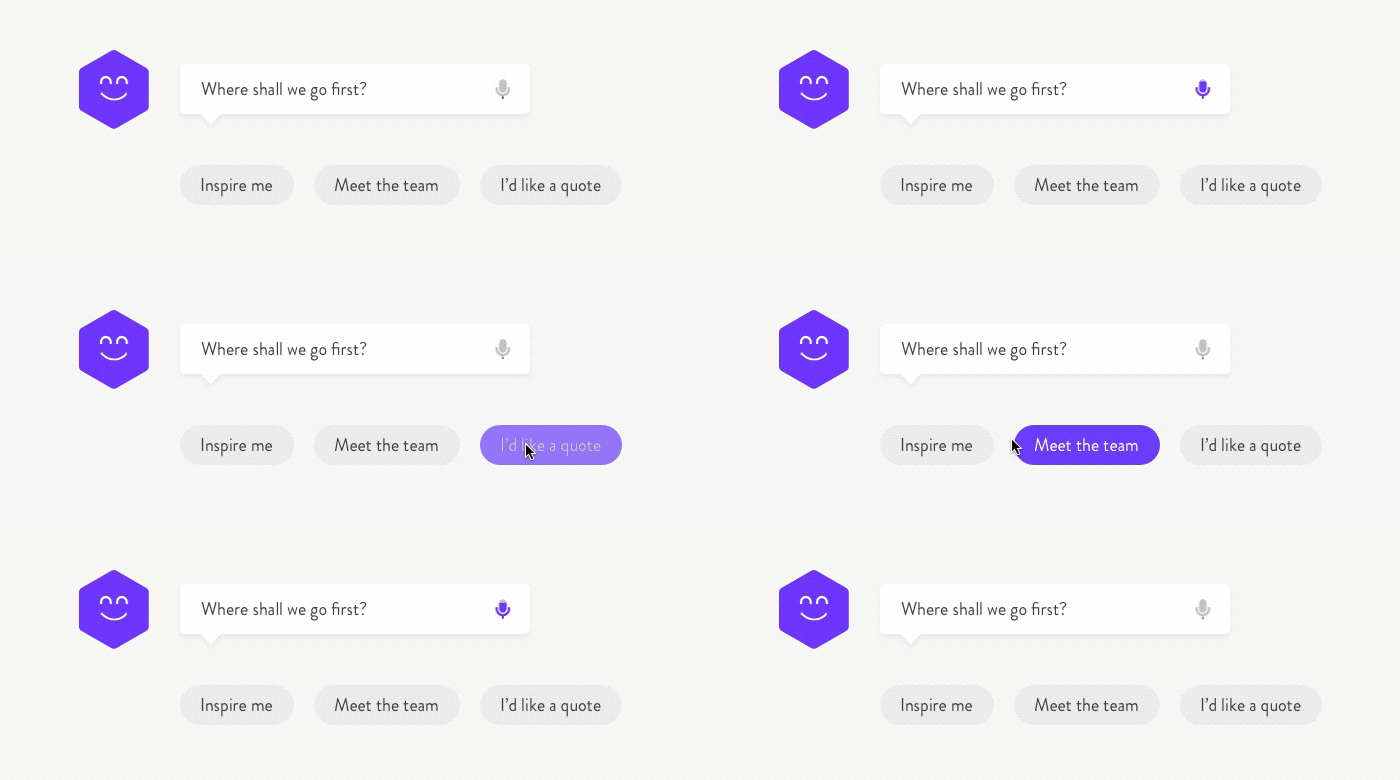
In this scenario I’ve reimagined the MadeByPi website and created a concept that is centred around starting a conversation to deliver content to the user. Let’s imagine that an initial prompt; “where shall we go first?” replaces the typical website navigation structure. We can abolish individual pages and deep navigation structures. There are no text links across the header, no burger icon or menu overlay and only a minimal amount of content on the page. Our logo, our PiBot, a text field with optional audible input and a few prompts which can either spur the conversation in a particular direction, or act as direct links to content.

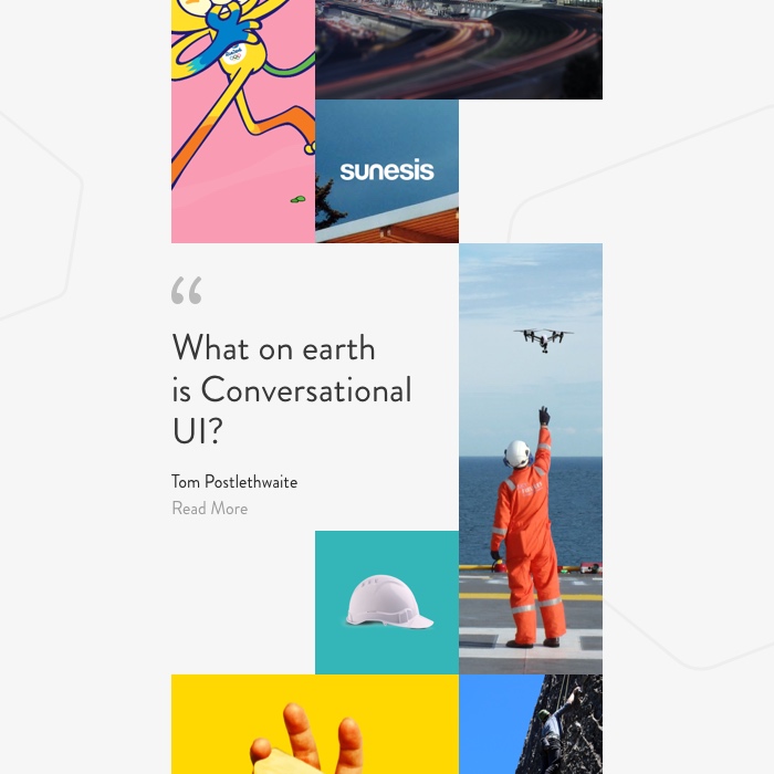
We do have a little more real estate to play with, so let’s introduce a simple feed that showcases a mixture of content from different areas of the site. Being able to show a sample of our work, studio culture and thoughts and opinions should compliment the CUI perfectly. It might just prompt the user to ask a question about a piece of content that they’ve seen, or encourage them to think a little deeper and ask about something that is more specific to their needs or interests.

A personified User Experience.
Let’s imagine that I’ve visited the MadeByPi site previously. On my second visit, PiBot remembers me and welcomes me back. In this scenario however, the CUI serves more relevant content in my feed, based on my previous visit and wider browsing history. After all, you wouldn’t expect to be given the same greeting if you visited a high street store on a second occasion. Let’s say that I spent several minutes reading through our Sky Futures case study the last time I visited the site. The CUI might suggest similar case studies, or present me with relevant blog posts. If I had only scrolled half way through the case study on my previous visit, the CUI might remember and ask if I’d like to continue where I left off, or offer me the opportunity to read something similar. If I sit inactive for a little while, the CUI might ask me how it can be of further assistance, or help to channel me in a more relevant direction.
An interesting start.
The idea is of course purely conceptual but it is an interesting prospect none the less. With some applied conversational logic and a deep understanding of human behaviour, there is the potential to re-imagine our browsing experience for the better. As CUI technology advances, multiple CUI engines will have the ability to communicate and share data with one another. A conversation that you might have had on one site could provide a very detailed insight into your behaviour and browsing habits as a user. That data could be interpreted by our CUI to build a predetermined persona and engage in a conversation that delivers a truly personal experience. I’ll be exploring CUI in further detail in a post a little further down the line. I’d quite like to re-design a popular product or service and apply some real user testing to understand the practicality of CUI in real-life scenarios.

by tomw